UX/UI DESIGN CONCEPT FOR MOBILE APP THAT MAKES GIFT SELECTION EASY
UNWRAPT
PROJECT SUMMARY
Personal project - A concept app that curates ideal gifts for your family and friends
RESPONSIBILITIES
-
User Research
-
UI Design
-
Storyboarding
-
Prototyping and testing
TIMELINE
1 month
OVERVIEW

A common problem I had observed and personally experienced; finding the right gift when you're short on time.
I was interested in investigating how people could discover gifts that were perfectly suited to gift recipients.
PROCESS

PROBLEM STATEMENT
I generated a problem statement based on my hypothesis that gift shopping can be difficult:
A person gift shopping who feels frustrated about getting the right present needs to make time to buy gifts but is time poor.
AFFINITY MAPPING
I conducted research interviews to validate that this was a genuine problem.
8 people (4 male, 4 female)
Aged between 24-67.

RESEARCH FINDINGS
I was able to distil the insights into 4 key areas.
People shopping for gifts:
-
Have trouble knowing what to buy
-
Feel awkward directly asking what someone would like to receive
-
Rely on intuition
-
Worry about disappointing the other person
-
Struggle to find the discipline to stick to a budget
-
Get overwhelmed with options
-
Are unsure of what is an appropriate amount to spend
-
Leave gift shopping too close to the date


PERSONA DEVELOPMENT
The post-its from the affinity map were rearranged into an empathy map canvas after conducting research. This helped to understand the audience's behaviors, pains, and gains, which was useful in creating personas.
PERSONA DEVELOPMENT
I used an empathy mapping template to assist with the creation of two personas, enabling me to keep their needs in mind when designing later on.

Click to enlarge
STORYBOARDING
I used storytelling as a way of conveying the touch points in the customer journey that were the most frustrating, and demonstrate how using the app would provide the customer with a solution.

Click to enlarge

Click to enlarge
HOW MIGHT WE...
Before jumping into specific ideas I came up with some HMW statements to direct my efforts toward solutions that were focused on building the right thing.
-
How might we assist people to budget properly when gift shopping?
-
How might we assist people to buy gifts when they are short on time?
-
How might we help people plan ahead so that they don’t feel rushed when shopping for gifts?
-
How might we better ascertain what people should purchase when buying a gift?
KEY DESIGN FOCUS AREAS
-
Reduce time for gift selection.
-
Plan gifts in advance.
-
Easily determine gift preferences.
-
Share gift ideas with friends.
IDEAS GENERATED
-
Personal Gift Lists Sharing: Similar to a registry.
-
Anonymous Purchases: Prevents recipients from knowing who bought the gifts to maintain surprise.
-
Social Media Profiles: Shows basic details of friends and shipping addresses.
-
Group Buying: Allows multiple people to contribute to a single gift.
-
Comment/Chat Feature: Enables discussions around group buying events.
Implementation Decision
-
All features were built except for:
-
Direct connection to e-commerce platforms for purchasing.
-
Budgeting tool.
-
-
Focus was on building a quickly testable prototype.

Implementation Decision
-
All features were built except for:
-
Direct connection to e-commerce platforms for purchasing.
-
Budgeting tool.
-
-
Focus was on building a quickly testable prototype.
DESIGN AND TESTING
User flows and wireframes were based around the idea of a social platform to help users find the right gifts.
Tested designs with 6 users (ages 26-66, 3 male and 3 female).
Key issues identified during testing:
-
Some screens lacked sufficient information, leaving users unclear about what to do.
-
Navigation was confusing, leading users to unexpected places.
-
Icons were not intuitive and required descriptions.

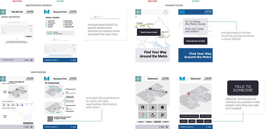
We incorporated usability improvements based on feedback obtained from earlier versions:
TESTING & FEEDBACK
Customers indicated that they wanted to know about the specific nature of disruptions so we made this information available from the home screen without the need to interact.
We found that button symbols were confusing, so added words to assist in navigation which also enabled us to increase the viewable area allocated for maps and timetables.
(Click images to enlarge)
RESULTS
Minimising the amount of clicks required to get to important, time- sensitive information was particularly important in this digital product.
What worked
-
Simple text copy on buttons and simple navigation
-
Borrowing from tried-and-tested design patterns
What needed improvement
We noted that our disruption alert screen was informative but was text heavy. This could be improved with better copywriting.
